Mentorship App
A structured mentorship platform for nonprofits, universities, and companies rebuilt so program leaders can prove impact instead of chasing it.
Mentorship App
A structured mentorship platform for nonprofits, universities, and companies rebuilt so program leaders can prove impact instead of chasing it.
Role
Lead UX Designer
Service
UX Desgin, Visual Design
Role
Lead UX Designer
Service
UX Desgin, Visual Design
Role
Lead UX Designer
Service
UX Desgin, Visual Design

The Situation
Mentorship fell apart in the gaps between calls. So stop optimizing for better matches. Optimize for the second session.
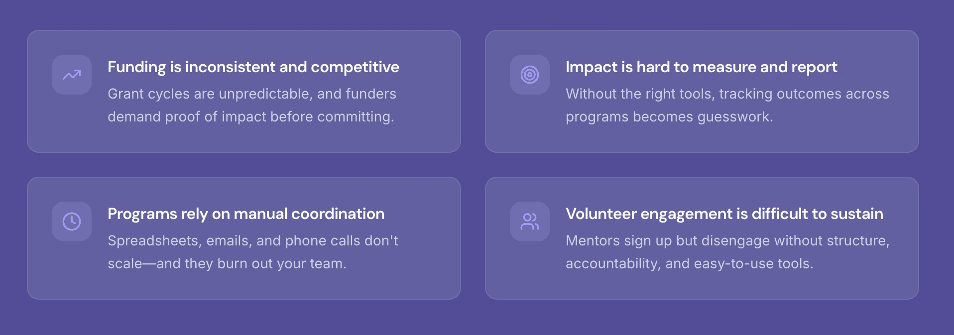
The program paired students with industry mentors but everything after the match lived in fragmented tools. Email threads, calendar invites, and one off video links. There was no shared space to schedule, track goals, or pick up where the last session left off. Renewals and sponsor funding depended on demonstrating outcomes the program had no way to measure.
A Shared Space
Research told me what was broken. Not what to build.
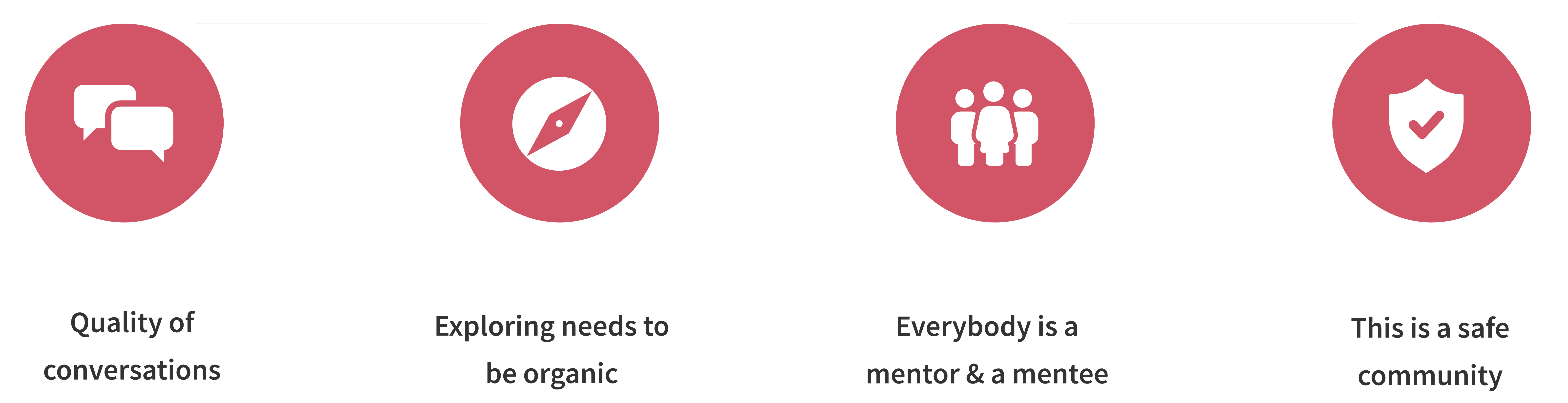
My first job wasn't designing it was translating, for myself and for the team. The feature list read as a set of asks, not a set of decisions: it named things like 'scheduling' and 'goal tracking' without saying which relationship problem each one was actually meant to solve.
So I went back through the interviews line by line, pulled out the repeating patterns behind those asks, and rewrote them as design principles I brought to the PM and engineers before a single screen existed so we'd be building against the evidence, not against a list of nouns.
Conversations are Core
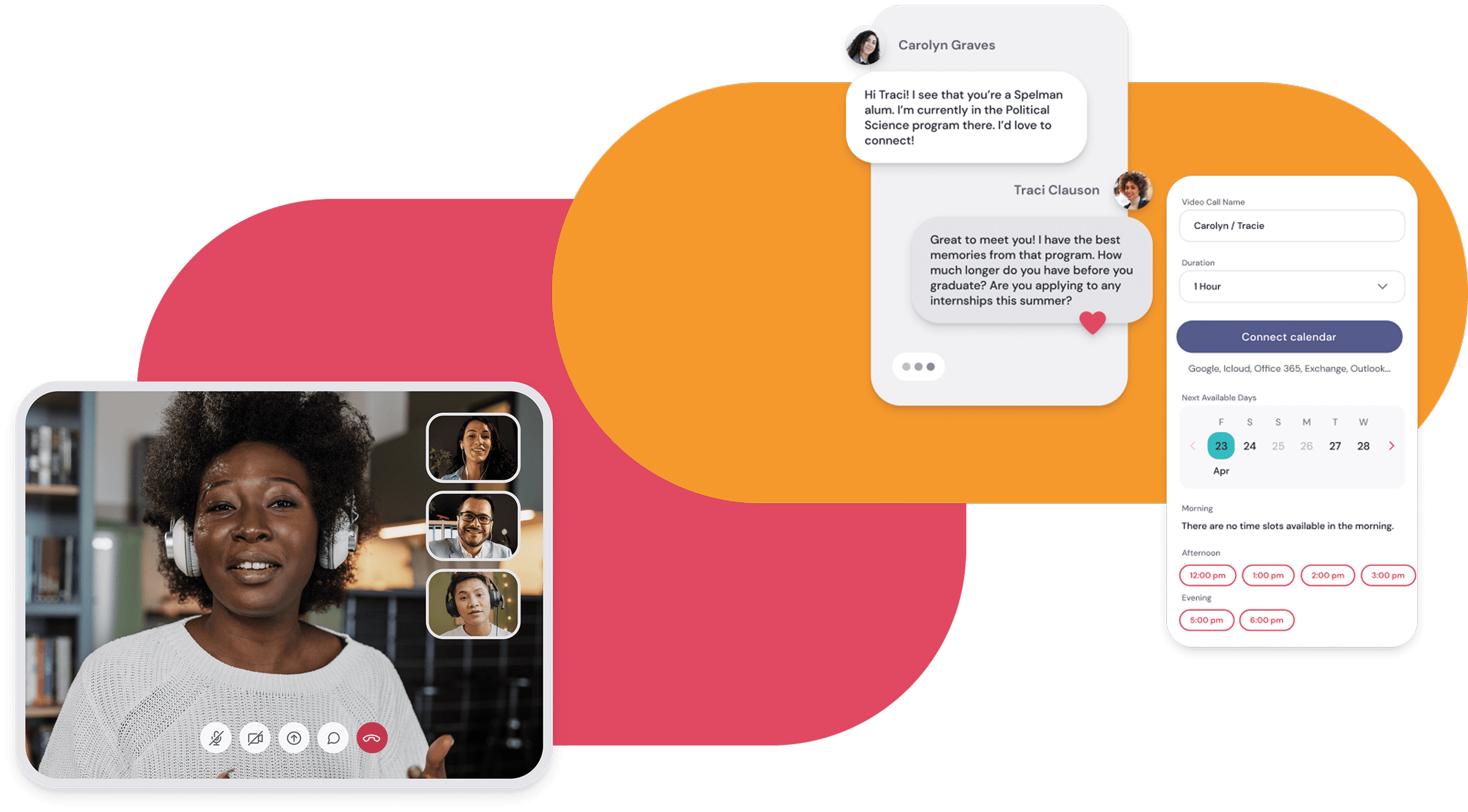
I identified the conversation as the product's core object, which reframed the information architecture: should the app organize around people or relationships?
I advocated for a relationship first IA over the original match-list concept. Instead of making users navigate into their only active connection, the conversation and next action became the home screen reducing friction and aligning the experience with the product's primary use case.
Identifying Admin Needs

Building a safe community
Create a safe space where users can have conversations and build a community.
Quick and Accurate Decisions
Ability to make smaller setting changes easily even at the main dashboard level.
Clear and Functional Designs
Present and organize data and available options in the cleanest way possible.
Scalability
Increase in users will directly lead to increase in data and admin user interaction.
Decisions & Tradeoffs
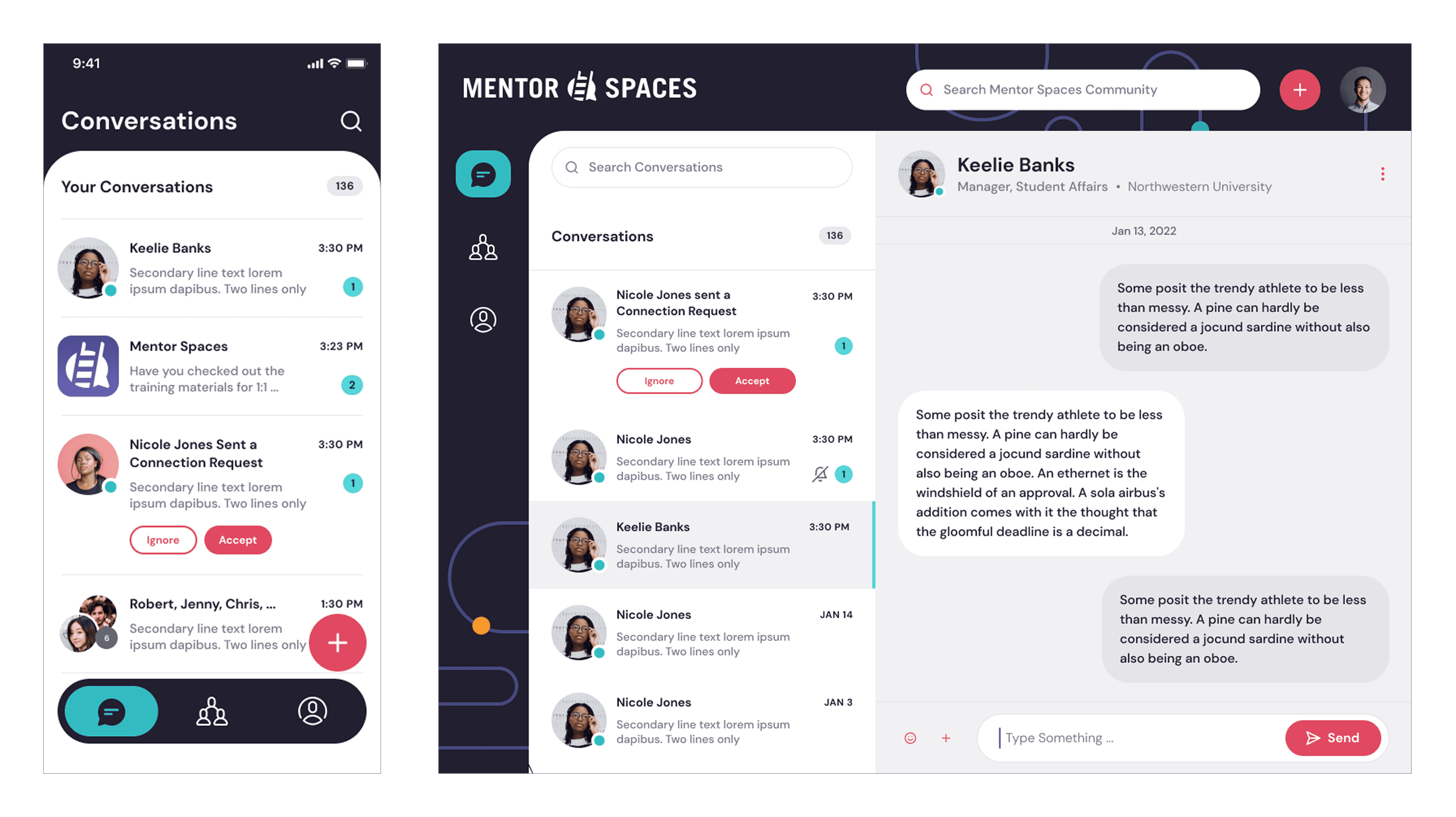
Home opens directly on the active conversation, not a dashboard.
Tradeoff: Less 'product-y,' and harder to show off in a demo but it removed a whole layer of clicking for the single most common use case.
Only two tabs: The conversation and everything else.
Tradeoff: Profile, resources, and settings all got demoted into one secondary tab a real cost to discoverability I accepted deliberately.
Scheduling lives inside the conversation, not a separate calendar section.
Tradeoff: No standalone 'My Schedule' view at home page but it meant booking a session never required leaving the thread where the ask naturally comes up.
Why it matters to Buyers
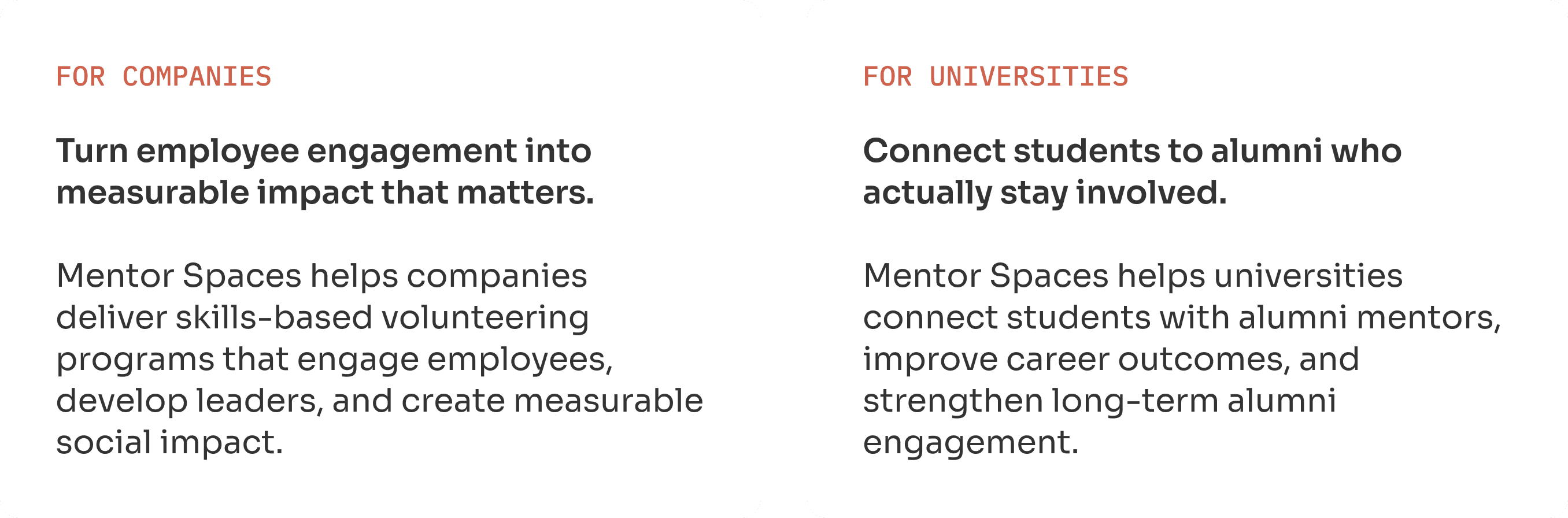
This wasn't just a nicer app for mentors. It was a business case for the people funding the program.
Companies and universities don't buy mentorship software because it's pleasant to use, they buy it because ad hoc volunteering and mentoring quietly fail to deliver what leadership actually asked for. Understanding that gap shaped what the product had to prove, not just what it had to do.
The Admin Experience
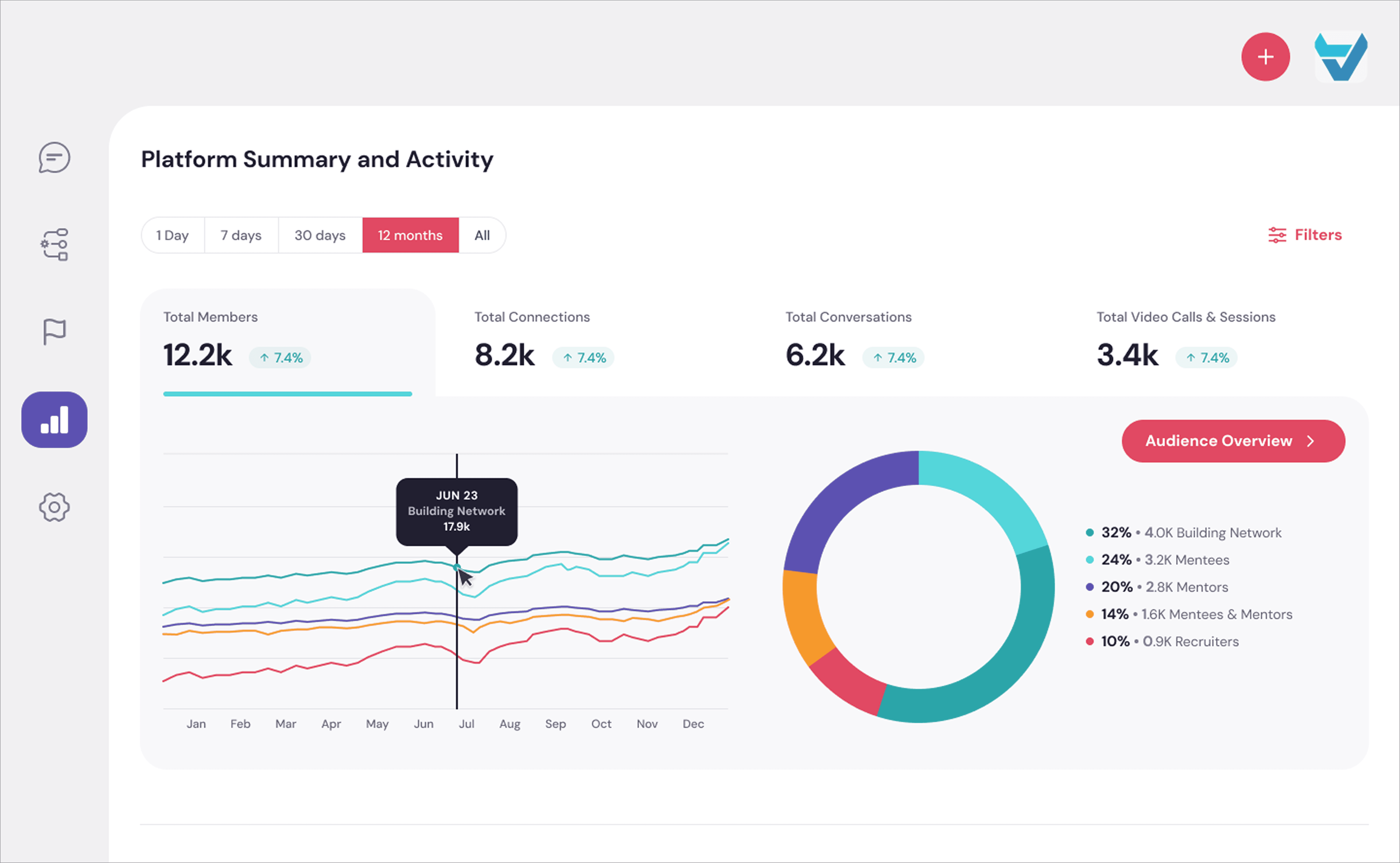
Where the buyer's proof actually lives
This is the screen a CSR or university team opens to justify the program's budget so its rows are exactly the data the funder pitch promised.Reflecting on my journey as a UX designer for this project, I was able to grow as a designer embracing collaboration, ownership, and adaptability.The conversation was the product. The console is how the program runs it.
Every mentee-facing decision had a mirror image on the operations side. Program admins needed to see, moderate, and report on hundreds of conversations without ever touching one directly - so I designed a companion console alongside the app, not after it.

What I learnt
Same core object, admin lens
The console reuses the conversation as its unit, not a separate case model an admin sees the same thread the mentor and mentee see, just at scale.
Built for the person who never opens it happily
Program admins use this to intervene, not to browse. Status, notes, and sortable columns front-load exactly what triage needs first.
Taking a project from 0 to 1
Creating valuable new intents for people at scale
Integrations with Technology
This project included using chat, video and calendar integrations.
Working simultaneously on web, mobile and responsive web versions.
Created a consistent design experience for all forms of media
Taking ownership while collaborating
Achieved product milestones and helped to create a balanced environment for the team
Project Impact
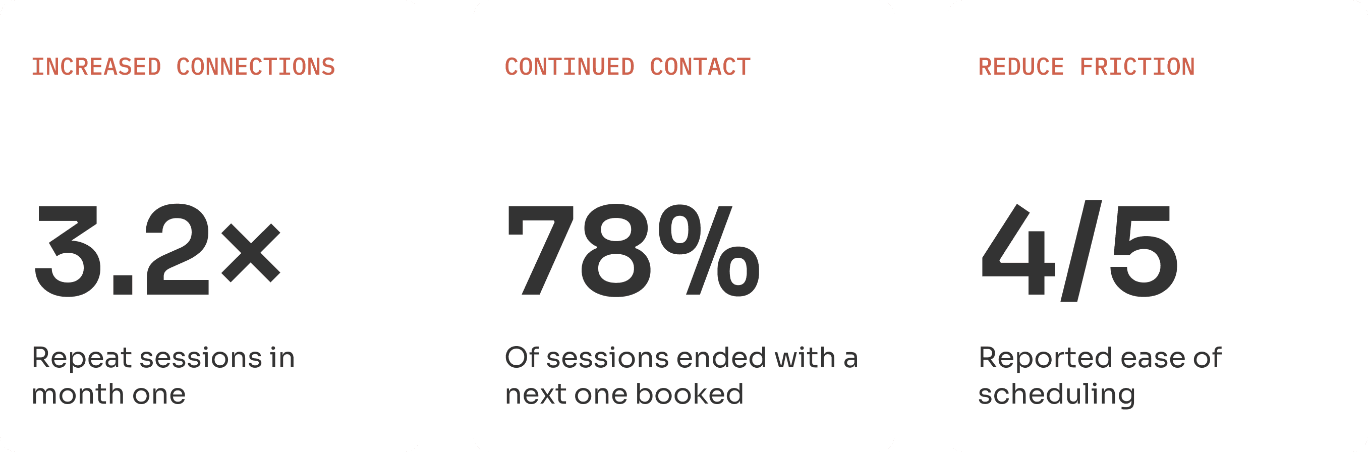
Research became a product people actually kept using.
Going from research to a working IA meant every early decision had to be defensible against real interview data, not intuition which made the navigation and conversation model far easier to hold the line on later, under deadline pressure.
The clearest signal it worked: the exact drop-off moment the research flagged after a good first call nearly disappeared. People weren't more motivated. The product just stopped asking them to supply the motivation themselves.
The Situation
Mentorship fell apart in the gaps between calls. So stop optimizing for better matches. Optimize for the second session.
The program paired students with industry mentors but everything after the match lived in fragmented tools. Email threads, calendar invites, and one off video links. There was no shared space to schedule, track goals, or pick up where the last session left off. Renewals and sponsor funding depended on demonstrating outcomes the program had no way to measure.
A Shared Space
Research told me what was broken. Not what to build.
My first job wasn't designing it was translating, for myself and for the team. The feature list read as a set of asks, not a set of decisions: it named things like 'scheduling' and 'goal tracking' without saying which relationship problem each one was actually meant to solve.
So I went back through the interviews line by line, pulled out the repeating patterns behind those asks, and rewrote them as design principles I brought to the PM and engineers before a single screen existed so we'd be building against the evidence, not against a list of nouns.
Conversations are Core
I identified the conversation as the product's core object, which reframed the information architecture: should the app organize around people or relationships?
I advocated for a relationship first IA over the original match-list concept. Instead of making users navigate into their only active connection, the conversation and next action became the home screen reducing friction and aligning the experience with the product's primary use case.
Identifying Admin Needs
Building a safe community
Create a safe space where users can have conversations and build a community.
Quick and Accurate Decisions
Ability to make smaller setting changes easily even at the main dashboard level.
Clear and Functional Designs
Present and organize data and available options in the cleanest way possible.
Scalability
Increase in users will directly lead to increase in data and admin user interaction.
Decisions & Tradeoffs
Home opens directly on the active conversation, not a dashboard.
Tradeoff: Less 'product-y,' and harder to show off in a demo but it removed a whole layer of clicking for the single most common use case.
Only two tabs: The conversation and everything else.
Tradeoff: Profile, resources, and settings all got demoted into one secondary tab a real cost to discoverability I accepted deliberately.
Scheduling lives inside the conversation, not a separate calendar section.
Tradeoff: No standalone 'My Schedule' view at home page but it meant booking a session never required leaving the thread where the ask naturally comes up.
Why it matters to Buyers
This wasn't just a nicer app for mentors. It was a business case for the people funding the program.
Companies and universities don't buy mentorship software because it's pleasant to use, they buy it because ad hoc volunteering and mentoring quietly fail to deliver what leadership actually asked for. Understanding that gap shaped what the product had to prove, not just what it had to do.
The Admin Experience
Where the buyer's proof actually lives
This is the screen a CSR or university team opens to justify the program's budget so its rows are exactly the data the funder pitch promised.Reflecting on my journey as a UX designer for this project, I was able to grow as a designer embracing collaboration, ownership, and adaptability.The conversation was the product. The console is how the program runs it.
Every mentee-facing decision had a mirror image on the operations side. Program admins needed to see, moderate, and report on hundreds of conversations without ever touching one directly - so I designed a companion console alongside the app, not after it.
This wasn't just a nicer app for mentors. It was a business case for the people funding the program.
Companies and universities don't buy mentorship software because it's pleasant to use, they buy it because ad hoc volunteering and mentoring quietly fail to deliver what leadership actually asked for. Understanding that gap shaped what the product had to prove, not just what it had to do.
What I learnt
Same core object, admin lens
The console reuses the conversation as its unit, not a separate case model an admin sees the same thread the mentor and mentee see, just at scale.
Built for the person who never opens it happily
Program admins use this to intervene, not to browse. Status, notes, and sortable columns front-load exactly what triage needs first.
Taking a project from 0 to 1
Creating valuable new intents for people at scale
Integrations with Technology
This project included using chat, video and calendar integrations.
Working simultaneously on web, mobile and responsive web versions.
Created a consistent design experience for all forms of media
Taking ownership while collaborating
Achieved product milestones and helped to create a balanced environment for the team
Where the buyer's proof actually lives
This is the screen a CSR or university team opens to justify the program's budget so its rows are exactly the data the funder pitch promised.Reflecting on my journey as a UX designer for this project, I was able to grow as a designer embracing collaboration, ownership, and adaptability.The conversation was the product. The console is how the program runs it.
Every mentee-facing decision had a mirror image on the operations side. Program admins needed to see, moderate, and report on hundreds of conversations without ever touching one directly - so I designed a companion console alongside the app, not after it.
Project Impact
Research became a product people actually kept using.
Going from research to a working IA meant every early decision had to be defensible against real interview data, not intuition which made the navigation and conversation model far easier to hold the line on later, under deadline pressure.
The clearest signal it worked: the exact drop-off moment the research flagged after a good first call nearly disappeared. People weren't more motivated. The product just stopped asking them to supply the motivation themselves.