Employee Metric Tool
An AI powered unified enterprise platform that consolidated access to multiple tools and streamlined complex workflows
Employee Metric Tool
An AI powered unified enterprise platform that consolidated access to multiple tools and streamlined complex workflows
Role
Product Designer
Service
Product Design, Strategy
Role
Product Designer
Service
Product Design, Strategy
Role
Product Designer
Service
Product Design, Strategy

Business Goals
Every Caliber Collision shop already tracked its performance just not in one place. Estimating and repair data lived in CCC One, customer surveys sat in a separate CRM, and carrier scorecards arrived as PDFs from insurance partners. To answer a simple question like 'how are we doing this week' a general manager had to log into three or four tools and reconcile the numbers by hand.
And the people closest to the work CSRs and technicians on the shop floor had the least time to look at any of it. Metrics existed, but nobody had a screen in front of them, or a reason to check it, until a problem had already become expensive.
How might the client make it easy for their employees to view their specific success metric, see where they need to improve and provide insights and actionable steps on how to improve.


Getting to know the shop
Before sketching a single screen, we spent time on the floor. A metrics tool designed at a desk is easy to get wrong for people who never sit at one so research started with three shifts shadowed in person, eight follow-up interviews, and a full audit of every tool a shop already touched in a day.
“I don't have a dashboard problem. I have a five-tools-open-at-once problem.”
-> General Manager - Owns the whole scorecard
Reports up to regional leadership weekly. Wanted one page that told the story before the meeting, not raw exports to interpret during it.
-> CSR - Owns the customer experience
Juggling phones, drop-offs, and surveys. Checked metrics in stolen two-minute gaps between customers never a sit-down session.
-> Painter - Owns the repair itself
Rarely opened a screen at all. Needed their numbers surfaced to them by a GM or CSR, not a login of their own to manage.
Main Dashboard
We designed Caliber Way as one home for every shop metric, organized around a simple idea: don't just show the numbers, tell people what to do about them. Three screens carry that idea end to end.
General Manager Dashboard
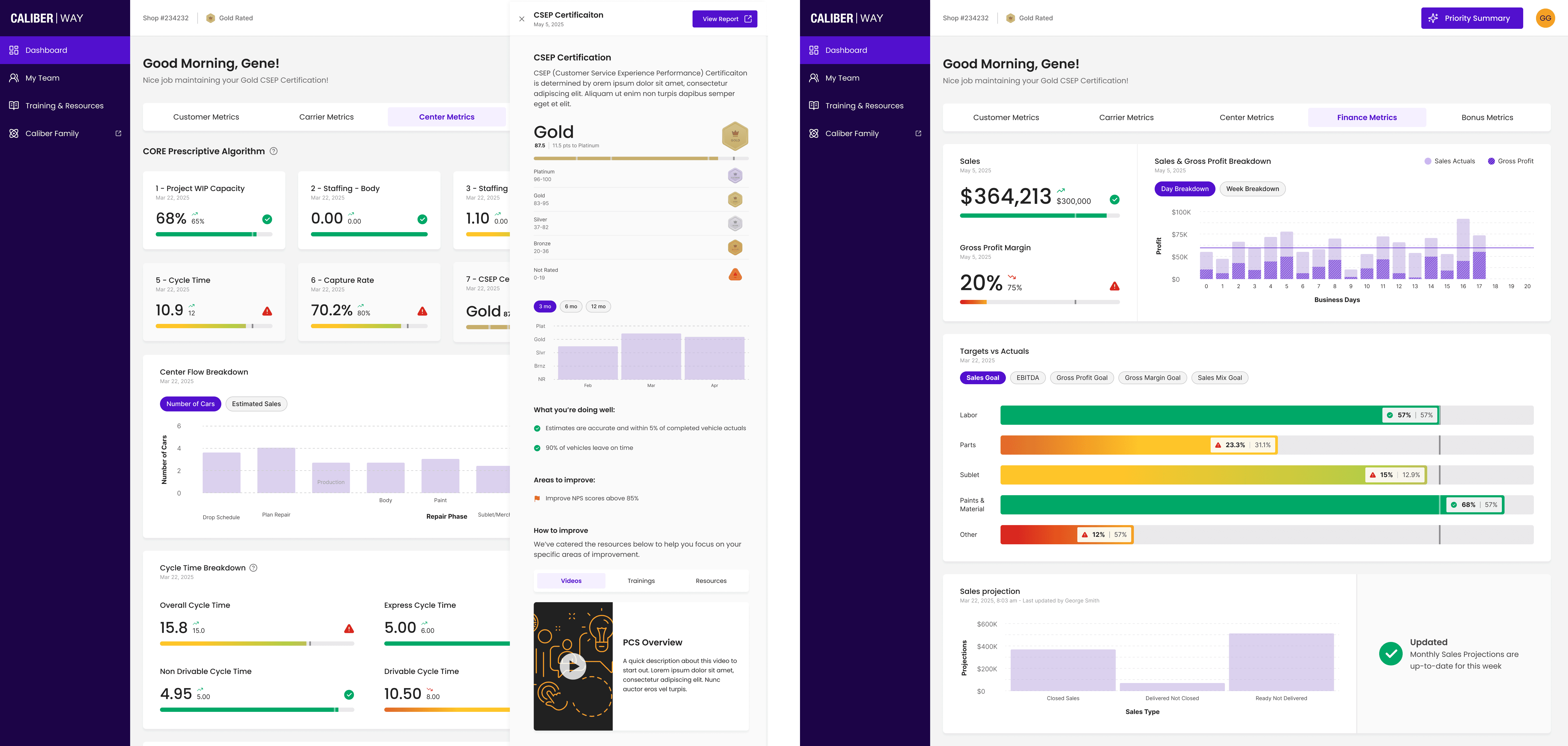
One dashboard, five tabs - Customer, Carrier, Center, Finance, and Bonus Metrics each grouping numbers the way a shop already thinks about its business, from sales and gross margin to targets vs. actuals and EBITDA. It's dense on purpose as this is the GM's command center but every bar carries its own target and status color, so a manager doesn't have to compute what “good” looks like before deciding what to do. A Priority Summary button sits fixed in the header, the escape hatch out of the detail whenever it's time to act instead of read
Metric to Action
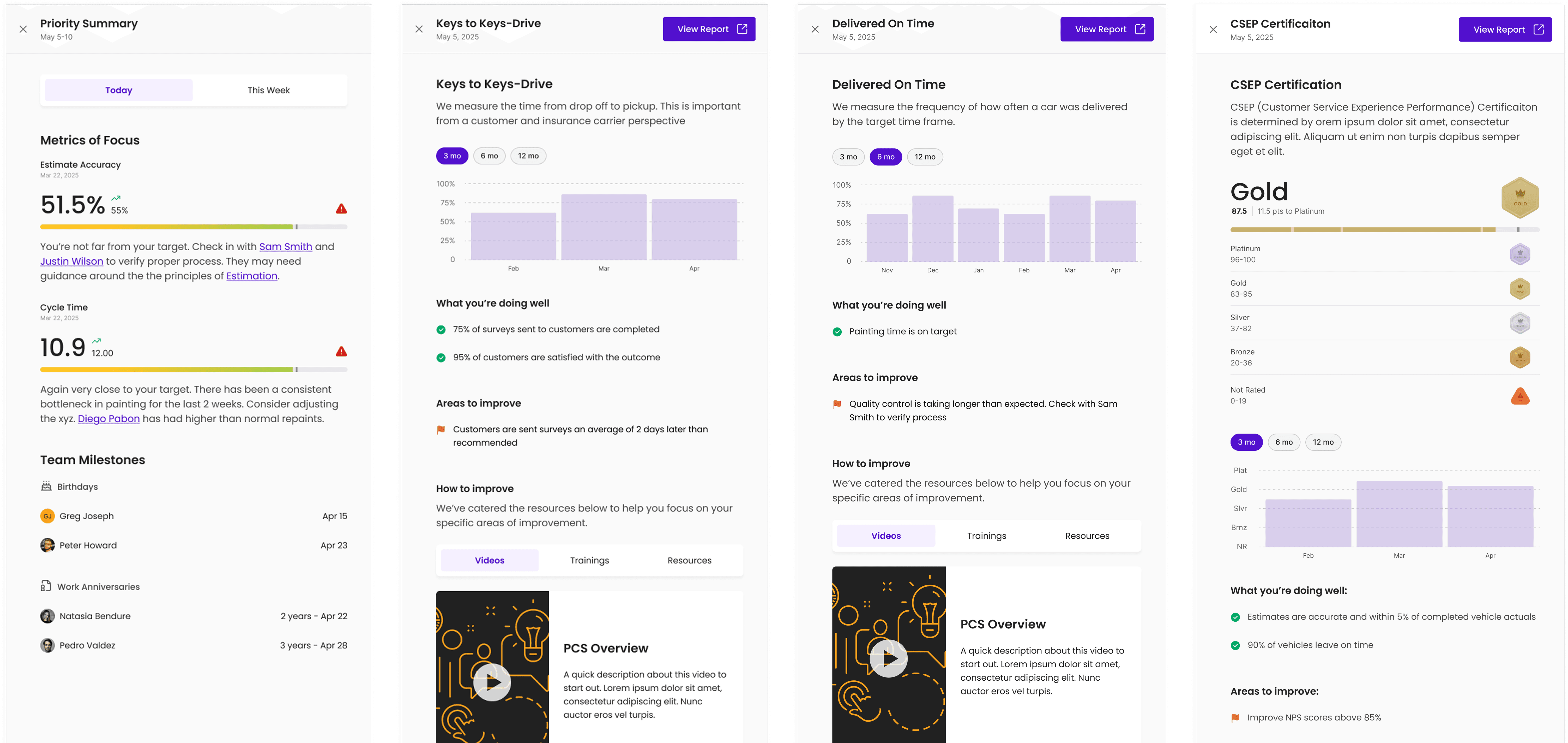
A dip in a score is only useful if it comes with a next step. Every flyout closes the loop with 'what you're doing well,' 'areas to improve,' and a matched video, training, or resource so a shop never has to guess how to fix what it just saw. The hard part was never displaying numbers it was collecting them and deciding which ones deserved a person's attention. AI sits in both places.
AI-Powered Workflows
The hard part was never displaying numbers it was collecting them and deciding which ones deserved a person's attention. AI sits in both places.
Pulling data out of the tools shops already use
→ Source systems
CCC One · carrier scorecards · customer survey & CRM tools
→ Aggregation layer
Normalizes every metric to one shop-level model
→ AI insight engine
Ranks, flags, and explains what changed
What changed
The clearest way to see the shift is to follow one GM through the same Monday morning, twice
Before -> ~45 minutes, before the first customer even walks in.
Logs into CCC One for cycle-time and repair data
Opens the CRM for survey and CSAT scores
Digs up carrier PDFs from email
Builds a spreadsheet to line all three up
Guesses which number is worth escalating
After -> Under 5 minutes — and it's the same judgment call, not a shortcut around it.
Opens Caliber Way
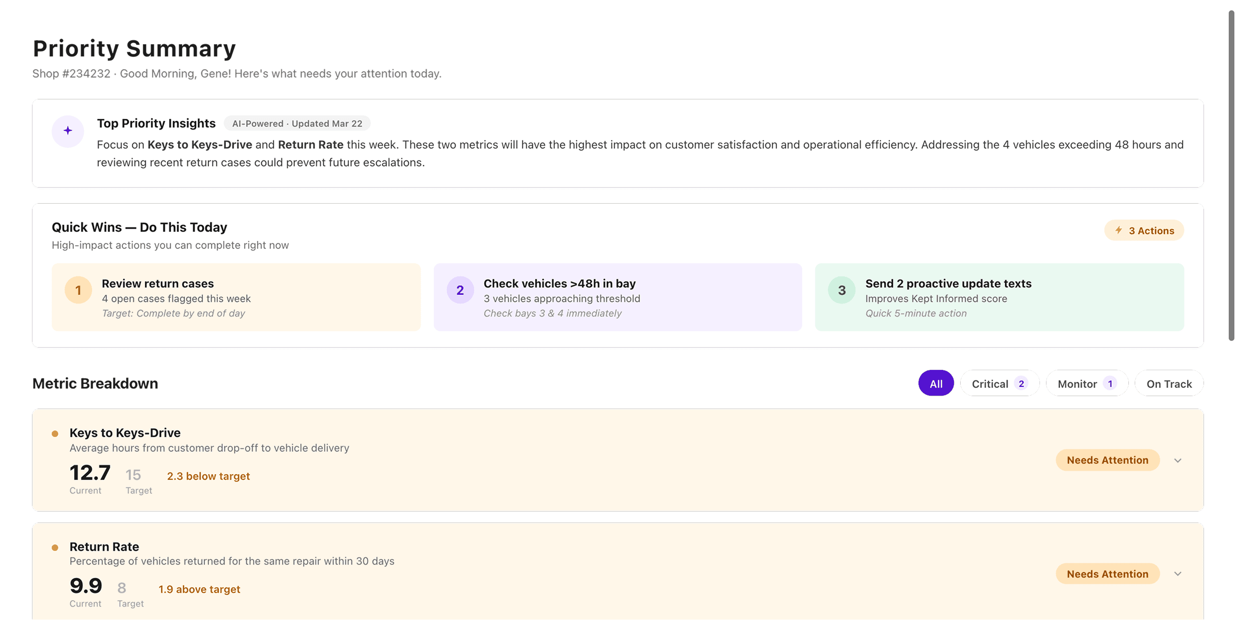
Reads the AI Priority Summary
Taps into the one flyout that needs a decision
Assigns the fix or shares the resource
Lessons learned
A summary beats a dashboard for people with no time to read one.
The Priority Summary was the single highest-leverage screen we built it did the reading so the shop didn't have to.
AI is most trusted when it explains itself.
Every flagged insight needed a visible why a raw score with no reasoning read as noise, not help.
Integration is the real product.
The interface was the easy half. Making CCC One and carrier data agree with each other was where the actual design problem lived.
Business Goals
Every Caliber Collision shop already tracked its performance just not in one place. Estimating and repair data lived in CCC One, customer surveys sat in a separate CRM, and carrier scorecards arrived as PDFs from insurance partners. To answer a simple question like 'how are we doing this week' a general manager had to log into three or four tools and reconcile the numbers by hand.
And the people closest to the work CSRs and technicians on the shop floor had the least time to look at any of it. Metrics existed, but nobody had a screen in front of them, or a reason to check it, until a problem had already become expensive.
How might the client make it easy for their employees to view their specific success metric, see where they need to improve and provide insights and actionable steps on how to improve.
Getting to know the shop
Before sketching a single screen, we spent time on the floor. A metrics tool designed at a desk is easy to get wrong for people who never sit at one so research started with three shifts shadowed in person, eight follow-up interviews, and a full audit of every tool a shop already touched in a day.
“I don't have a dashboard problem. I have a five-tools-open-at-once problem.”
-> General Manager - Owns the whole scorecard
Reports up to regional leadership weekly. Wanted one page that told the story before the meeting, not raw exports to interpret during it.
-> CSR - Owns the customer experience
Juggling phones, drop-offs, and surveys. Checked metrics in stolen two-minute gaps between customers never a sit-down session.
-> Painter - Owns the repair itself
Rarely opened a screen at all. Needed their numbers surfaced to them by a GM or CSR, not a login of their own to manage.
Main Dashboard
We designed Caliber Way as one home for every shop metric, organized around a simple idea: don't just show the numbers, tell people what to do about them. Three screens carry that idea end to end.
General Manager Dashboard
One dashboard, five tabs - Customer, Carrier, Center, Finance, and Bonus Metrics each grouping numbers the way a shop already thinks about its business, from sales and gross margin to targets vs. actuals and EBITDA. It's dense on purpose as this is the GM's command center but every bar carries its own target and status color, so a manager doesn't have to compute what “good” looks like before deciding what to do. A Priority Summary button sits fixed in the header, the escape hatch out of the detail whenever it's time to act instead of read
Metric to Action
A dip in a score is only useful if it comes with a next step. Every flyout closes the loop with 'what you're doing well,' 'areas to improve,' and a matched video, training, or resource so a shop never has to guess how to fix what it just saw. The hard part was never displaying numbers it was collecting them and deciding which ones deserved a person's attention. AI sits in both places.
AI-Powered Workflows
The hard part was never displaying numbers it was collecting them and deciding which ones deserved a person's attention. AI sits in both places.
Pulling data out of the tools shops already use
→ Source systems
CCC One · carrier scorecards · customer survey & CRM tools
→ Aggregation layer
Normalizes every metric to one shop-level model
→ AI insight engine
Ranks, flags, and explains what changed
What changed
The clearest way to see the shift is to follow one GM through the same Monday morning, twice
Before -> ~45 minutes, before the first customer even walks in.
Logs into CCC One for cycle-time and repair data
Opens the CRM for survey and CSAT scores
Digs up carrier PDFs from email
Builds a spreadsheet to line all three up
Guesses which number is worth escalating
After -> Under 5 minutes — and it's the same judgment call, not a shortcut around it.
Opens Caliber Way
Reads the AI Priority Summary
Taps into the one flyout that needs a decision
Assigns the fix or shares the resource
Lessons learned
A summary beats a dashboard for people with no time to read one.
The Priority Summary was the single highest-leverage screen we built it did the reading so the shop didn't have to.
AI is most trusted when it explains itself.
Every flagged insight needed a visible why a raw score with no reasoning read as noise, not help.
Integration is the real product.
The interface was the easy half. Making CCC One and carrier data agree with each other was where the actual design problem lived.
The clearest way to see the shift is to follow one GM through the same Monday morning, twice
Before -> ~45 minutes, before the first customer even walks in.
Logs into CCC One for cycle-time and repair data
Opens the CRM for survey and CSAT scores
Digs up carrier PDFs from email
Builds a spreadsheet to line all three up
Guesses which number is worth escalating
After -> Under 5 minutes — and it's the same judgment call, not a shortcut around it.
Opens Caliber Way
Reads the AI Priority Summary
Taps into the one flyout that needs a decision
Assigns the fix or shares the resource
A summary beats a dashboard for people with no time to read one.
The Priority Summary was the single highest-leverage screen we built it did the reading so the shop didn't have to.
AI is most trusted when it explains itself.
Every flagged insight needed a visible why a raw score with no reasoning read as noise, not help.
Integration is the real product.
The interface was the easy half. Making CCC One and carrier data agree with each other was where the actual design problem lived.