App Marketplace
I rebuilt the publish workflow of an enterprise app marketplace turning a slow, opaque submission process into one developers could see through, start to finish.
App Marketplace
I rebuilt the publish workflow of an enterprise app marketplace turning a slow, opaque submission process into one developers could see through, start to finish.
Role
UX Designer
Service
User Experience
Role
UX Designer
Service
User Experience
Role
UX Designer
Service
User Experience

Background
A publish process nobody could see through.
The current app publishing process was too lengthy, too complex, too effortful, and gave developers no real support along the way. It needed a full design and technical overhaul before the marketplace could scale.
I framed the case study around one throughline: from submission requirements to review procedures, from developer support to feedback mechanisms every facet of the system needed to earn back the trust of the people publishing through it.

User Needs
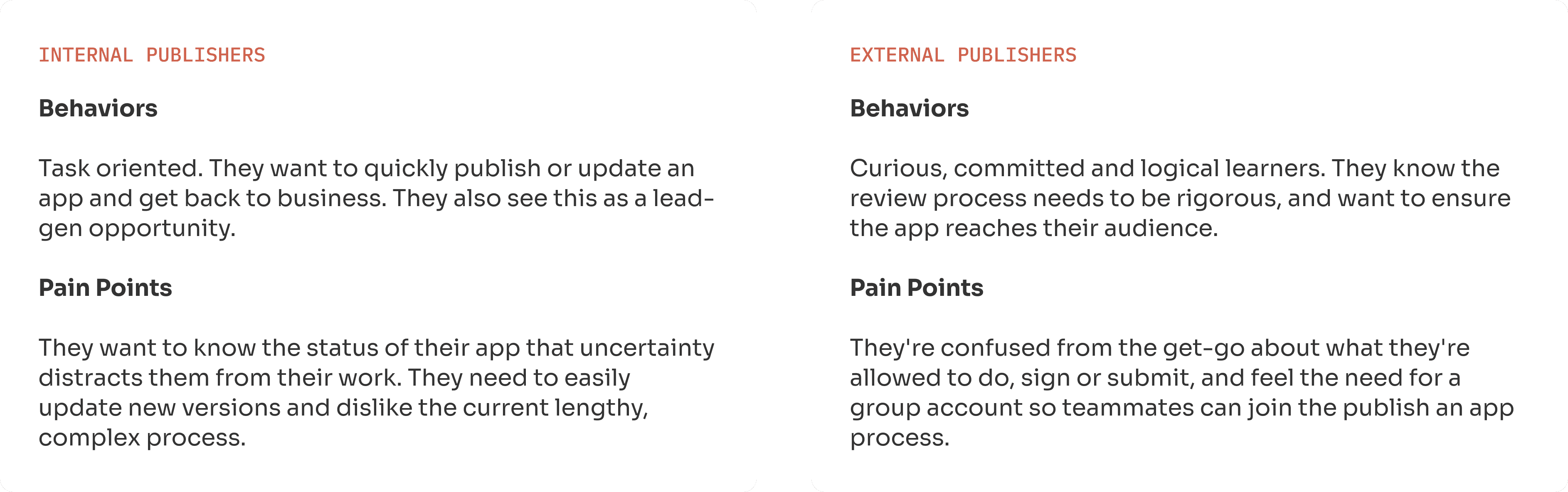
Before touching a single screen, I worked with our design strategists to separate the marketplace's two very different publisher types - internal teams shipping their own tools, and outside developers navigating a process built for someone else.
Current Journey
Where both personas were getting stuck.
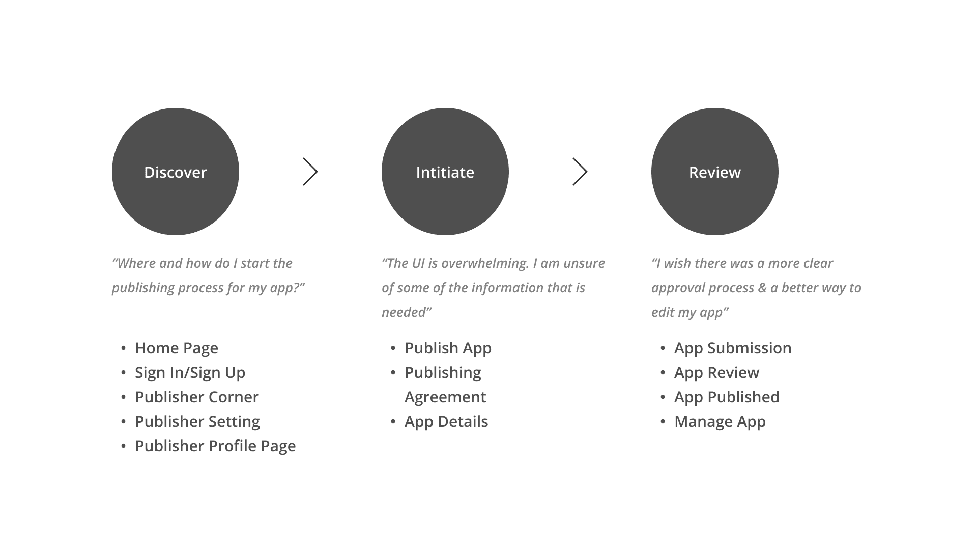
I mapped the current process end to end for both personas to find exactly where it broke down not just where it was slow.
Redesigned Journey
What the ideal process looks like.
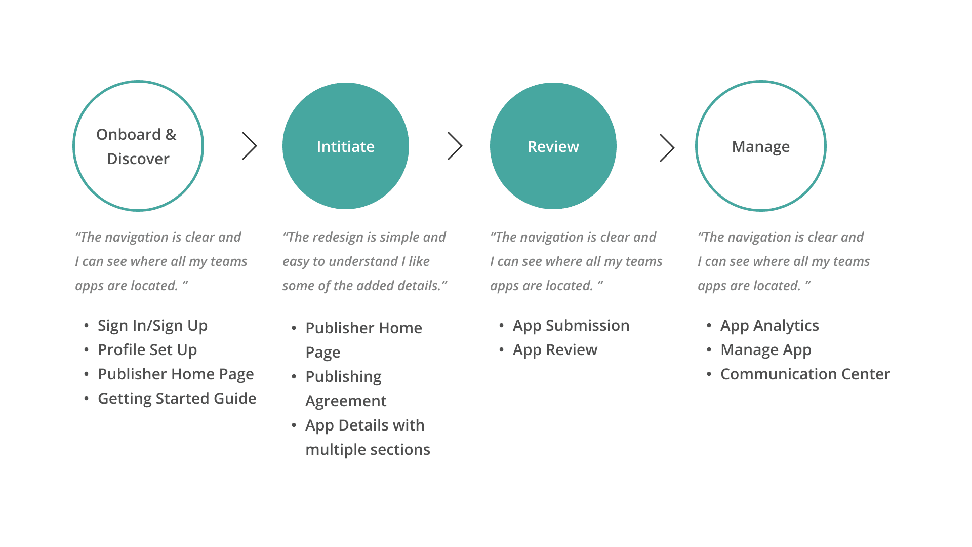
Applying those three principles end to end reshaped the same journey I'd mapped earlier into one with visible progress and a clear next step at every stage.
Key Principles
Every gap in the current journey traced back to one of three things: the interface didn't guide people, the process didn't set expectations, and nobody heard back in time. I set these as the design principles for the whole redesign.
Intuitive UI/UX
• Enhanced visual and content based chunking for coherence.
• Integrate a progress bar/visual so users can identify where they are and what comes next.
• Limit visual design options for consistency on storefront.
Clarity
• Upfront expectations that address requirements & prepare publishers for the workflow.
• Clear pathways for internal and external publishers both new and returning
• Create a getting started guide that helps publishers recognize the process.
Timely Communication
• Design a communications tool and/or incident tracking system inside the publishing corner to address tracking approval, problem solving, billing updates etc.
The Design
A peek into the final layouts.
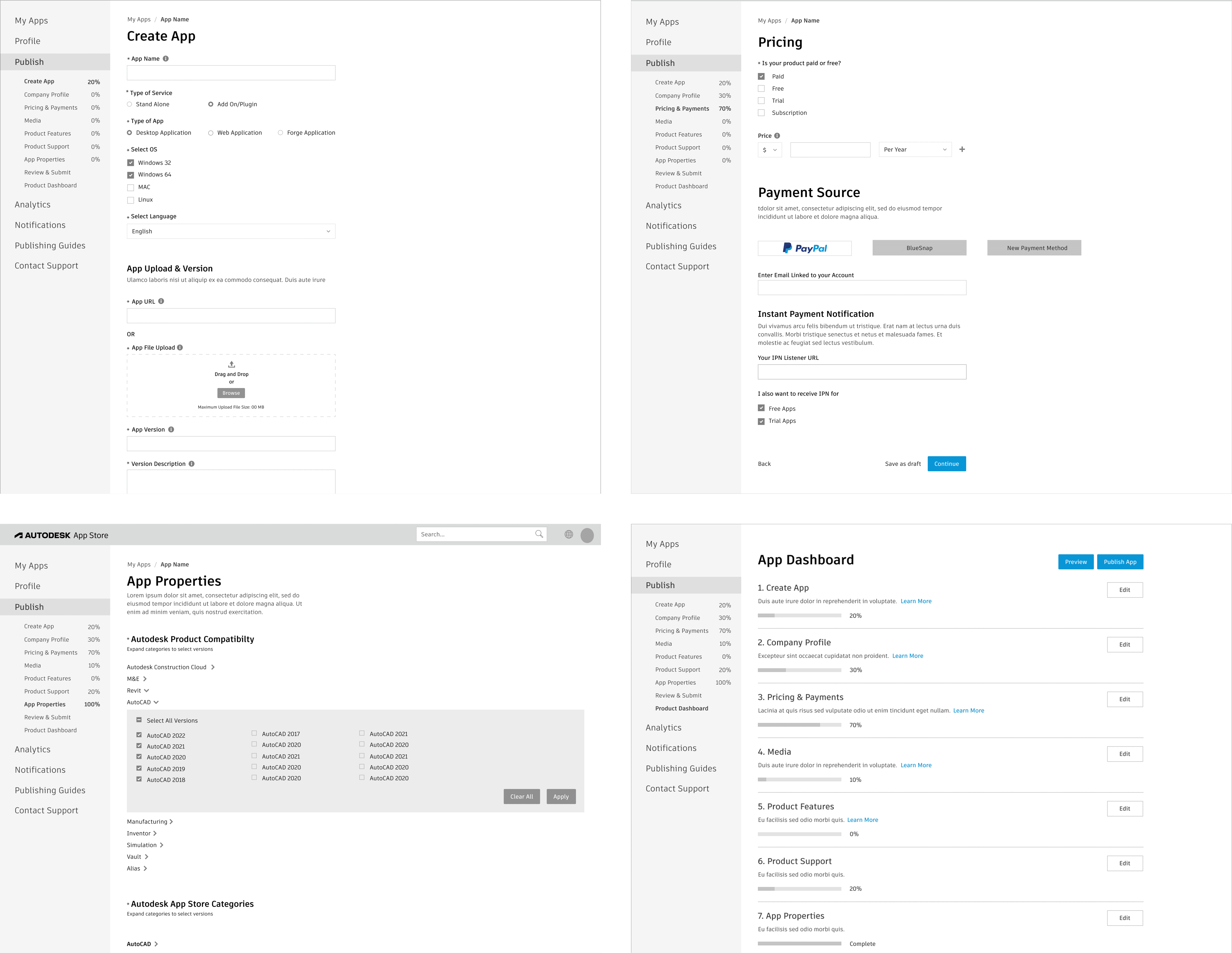
The final UX designs give developers a seamless, step by step interface for publishing an app. The experience prioritizes clarity, simplicity and efficiency minimizing the effort required to submit an app while maximizing the chances of approval. Three moves carried the weight of that redesign.
Comms Center
The timely-communication principle became its own feature: a built-in messaging system inside the developer dashboard. Developers can ask about submission guidelines, get clarification on review feedback, or request help with technical issues without leaving the flow.
A threaded message list keeps every conversation with platform administrators in one place, tied to the app it's about.
Notifications surface the moment a reviewer responds or a status changes, closing the silent gaps flagged in the current-journey research.

Design Impact
Increase in apps published
Clear, concise and easy pathway to publication decreases drop-off.Increase in use of analytics
A clear path to a relevant dashboard supports this KPI.Increase in web apps using the custom portal
A two-way point of entry, using the app store to incentivize these developers.Apps are kept up to date
Increased ease and usability for updating new versions of apps.Reduction in out-of-date app usage
Since the audience knows new versions are published, they're able to update their apps.Increase in customers who review apps
On target to design an interface that achieves this KPI in the next phase.
Background
A publish process nobody could see through.
The current app publishing process was too lengthy, too complex, too effortful, and gave developers no real support along the way. It needed a full design and technical overhaul before the marketplace could scale.
I framed the case study around one throughline: from submission requirements to review procedures, from developer support to feedback mechanisms every facet of the system needed to earn back the trust of the people publishing through it.
User Needs
Before touching a single screen, I worked with our design strategists to separate the marketplace's two very different publisher types - internal teams shipping their own tools, and outside developers navigating a process built for someone else.
Current Journey
Where both personas were getting stuck.
I mapped the current process end to end for both personas to find exactly where it broke down not just where it was slow.
Redesigned Journey
What the ideal process looks like.
Applying those three principles end to end reshaped the same journey I'd mapped earlier into one with visible progress and a clear next step at every stage.
Key Principles
Every gap in the current journey traced back to one of three things: the interface didn't guide people, the process didn't set expectations, and nobody heard back in time. I set these as the design principles for the whole redesign.
Intuitive UI/UX
• Enhanced visual and content based chunking for coherence.
• Integrate a progress bar/visual so users can identify where they are and what comes next.
• Limit visual design options for consistency on storefront.
Clarity
• Upfront expectations that address requirements & prepare publishers for the workflow.
• Clear pathways for internal and external publishers both new and returning
• Create a getting started guide that helps publishers recognize the process.
Timely Communication
• Design a communications tool and/or incident tracking system inside the publishing corner to address tracking approval, problem solving, billing updates etc.
The Design
A peek into the final layouts.
The final UX designs give developers a seamless, step by step interface for publishing an app. The experience prioritizes clarity, simplicity and efficiency minimizing the effort required to submit an app while maximizing the chances of approval. Three moves carried the weight of that redesign.
Comms Center
The timely-communication principle became its own feature: a built-in messaging system inside the developer dashboard. Developers can ask about submission guidelines, get clarification on review feedback, or request help with technical issues without leaving the flow.
A threaded message list keeps every conversation with platform administrators in one place, tied to the app it's about.
Notifications surface the moment a reviewer responds or a status changes, closing the silent gaps flagged in the current-journey research.
A peek into the final layouts.
The final UX designs give developers a seamless, step by step interface for publishing an app. The experience prioritizes clarity, simplicity and efficiency minimizing the effort required to submit an app while maximizing the chances of approval. Three moves carried the weight of that redesign.
Design Impact
Increase in apps published
Clear, concise and easy pathway to publication decreases drop-off.Increase in use of analytics
A clear path to a relevant dashboard supports this KPI.Increase in web apps using the custom portal
A two-way point of entry, using the app store to incentivize these developers.Apps are kept up to date
Increased ease and usability for updating new versions of apps.Reduction in out-of-date app usage
Since the audience knows new versions are published, they're able to update their apps.Increase in customers who review apps
On target to design an interface that achieves this KPI in the next phase.
The timely-communication principle became its own feature: a built-in messaging system inside the developer dashboard. Developers can ask about submission guidelines, get clarification on review feedback, or request help with technical issues without leaving the flow.
A threaded message list keeps every conversation with platform administrators in one place, tied to the app it's about.
Notifications surface the moment a reviewer responds or a status changes, closing the silent gaps flagged in the current-journey research.