Biometric Matching
A decade old fingerprint identification system, rebuilt for the cloud for examiners whose work has to hold up in court.
Biometric Matching
A decade old fingerprint identification system, rebuilt for the cloud for examiners whose work has to hold up in court.
Role
Lead UX Designer
Service
UX Design, Product Research & Strategy
Role
Lead UX Designer
Service
UX Design, Product Research & Strategy
Role
Lead UX Designer
Service
UX Design, Product Research & Strategy

The Challenge
The system examiners used to match fingerprints and support criminal investigations hadn't been redesigned in nearly ten years. Moving it to the cloud was the forcing function: rebuild the interface for real, or ship the legacy UX into the next decade. I was brought in to own the redesign end to end after those earlier attempts the mandate was to succeed where a purely visual refresh hadn't. This is expert software in a high-consequence domain: the people who use it every day know it deeply, and their results have to hold up in court.
"The redesign had to complement examiner's expertise, not compromise it"


Existing Tension
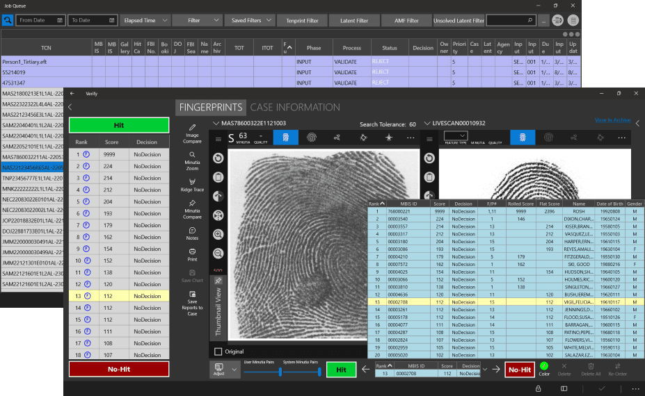
A consumer product instinct would be to declutter the interface. But in forensic examination, hiding ridge detail, tools, or contextual information at the moment of analysis doesn't create clarity it slows decisions and increases the risk of error. The goal wasn't to make the product simpler or denser. The redesign embraced a simple principle:
"Make routine tasks easier to manage, and make critical information impossible to miss. "
The Design Workflow
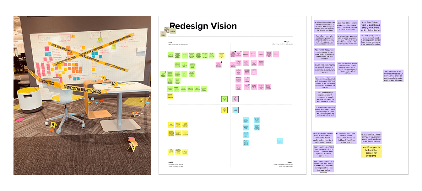
I designed and facilitated the workshops myself with forensic specialists, product, and engineering in the same room and then translated the wall of notes into a digital journey map that became the team's single source of truth. It's the artifact I used to align three teams and settle every prioritization debate that followed.
Simplifying the Architecture
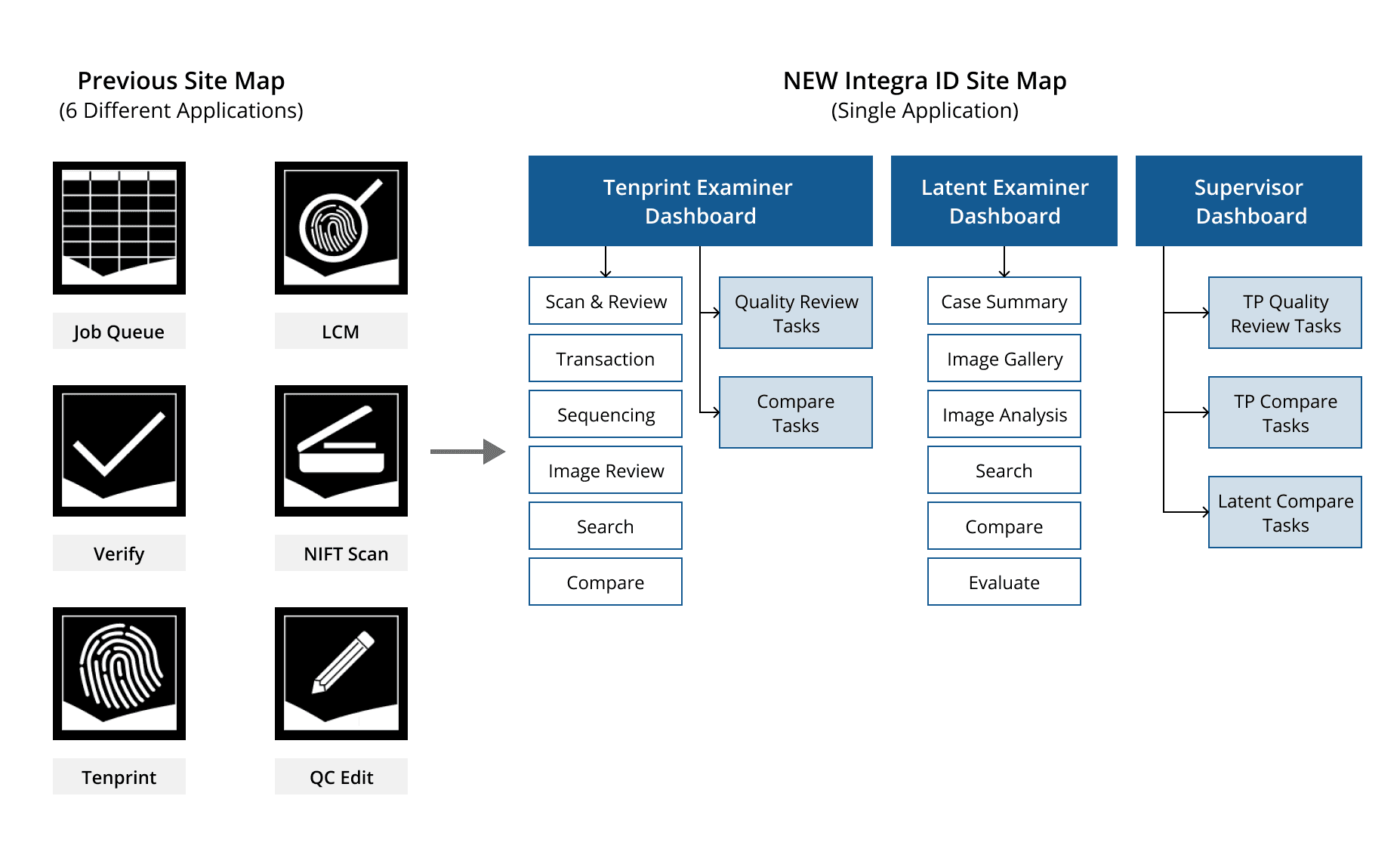
The current application consists of 6 separate apps and users need to consistently jump in and out of all of them to complete a single task. The new architecture helps to create a step by step process while also allowing users to directly jump in different sections when needed.
2 shells, 1 forensic core
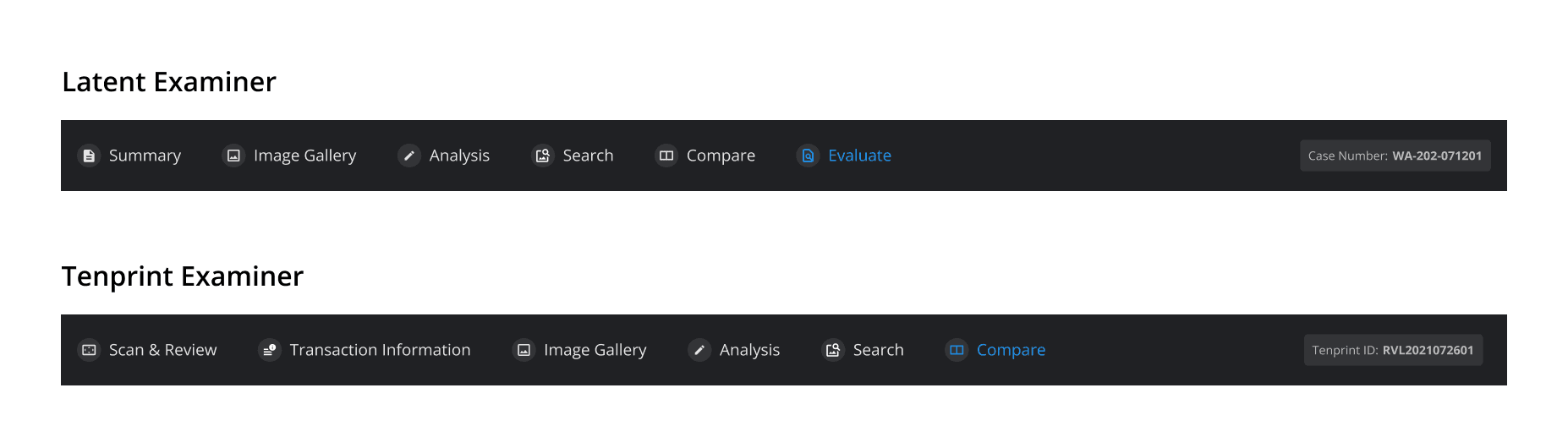
Tenprint and Latent examiners need almost opposite things from the same product. Rather than force one layout to serve both, I made the structural call to split the experience into role based shells over a single shared core matching engine, data, and audit trail so each team could move fast without the other's needs pulling against them.
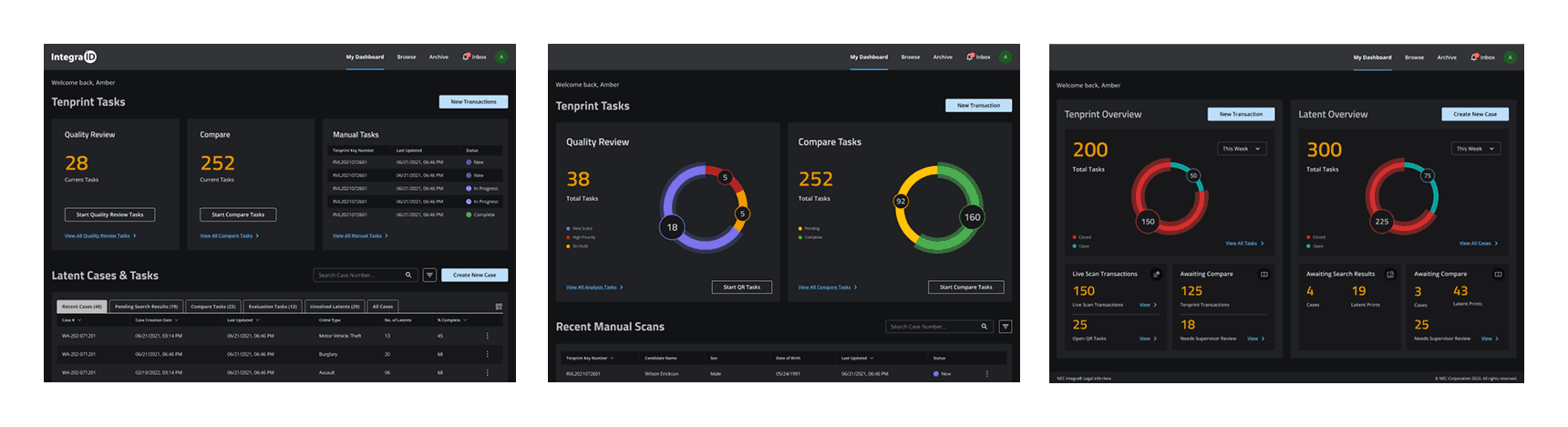
A Role Based Dashboard
Everyone lands in their own world.
Each role opens to a dashboard tuned to their job. The tenprint examiner to a throughput queue, the latent examiner to active comparisons, the supervisor to workload and verification status. No more hunting through a screen built for someone else.
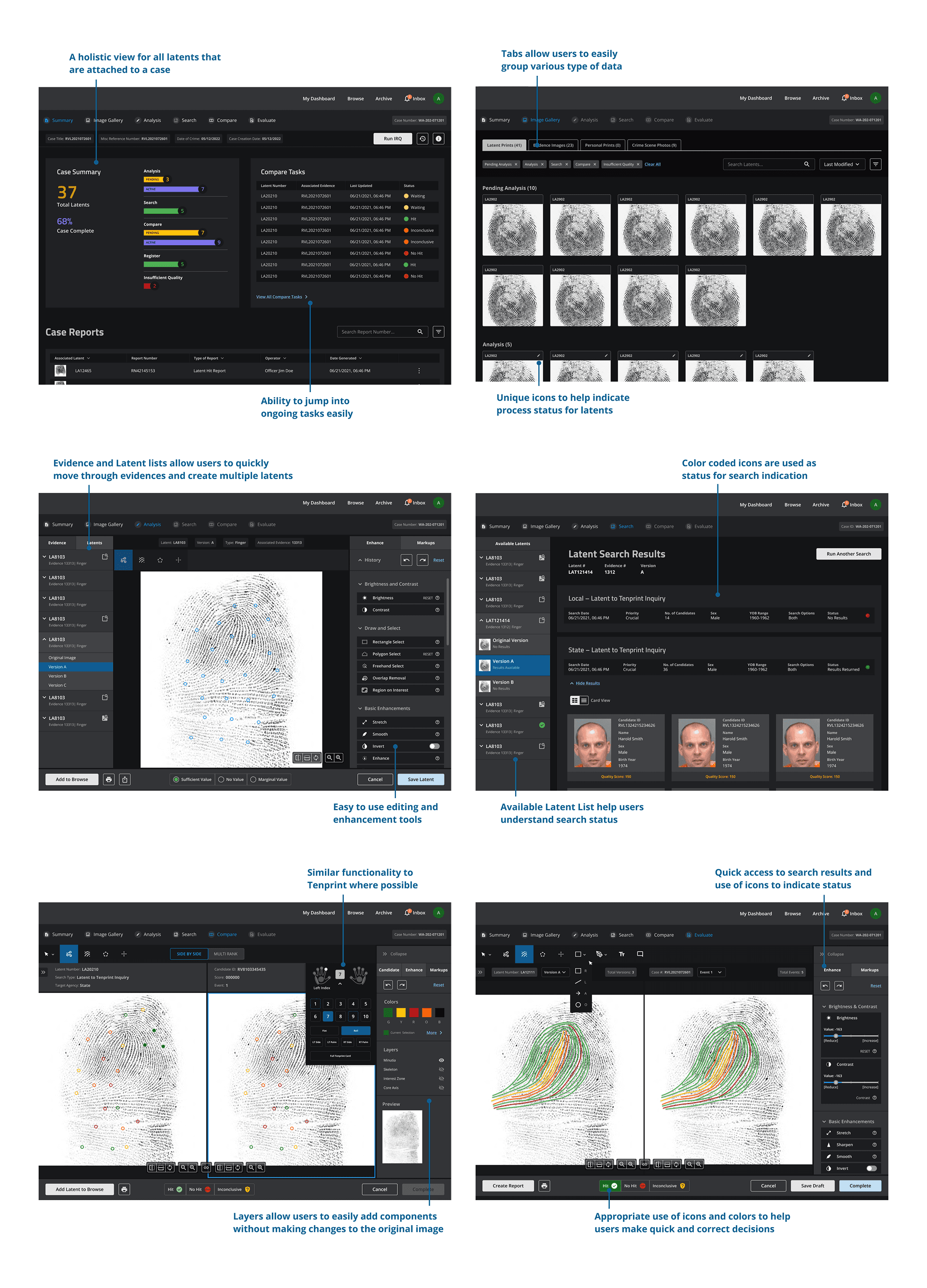
Evidence Processing
Where the identification actually happens.
The ACE-V comparison view is the heart of the product: a latent print and a candidate side by side, with the tools to analyze, mark, and evaluate. I designed it to keep the examiner's full attention on the ridges, powerful controls, minimal chrome, every step recorded for the record.
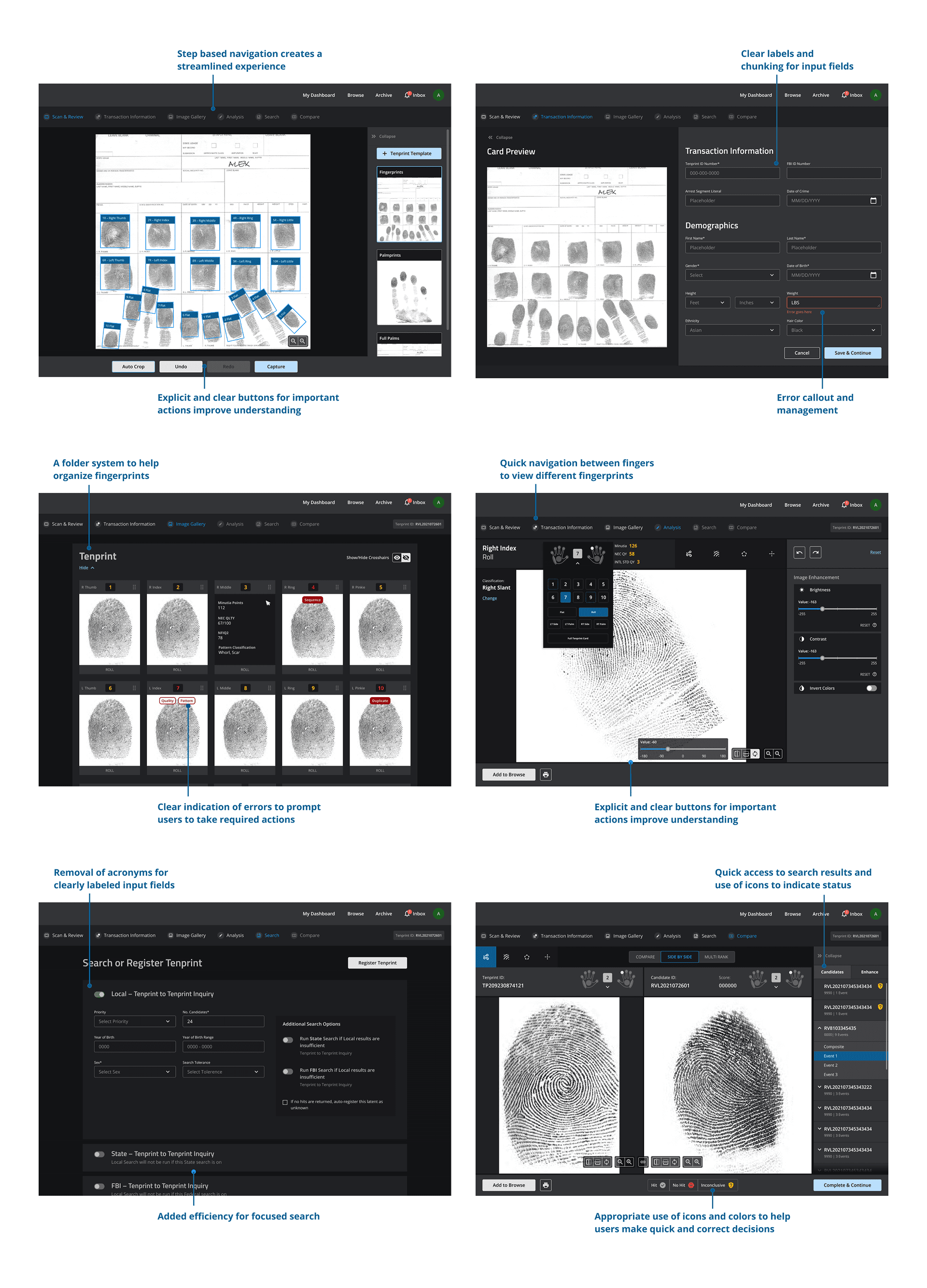
Identity Verification
Built for the queue.
For high-volume booking prints, throughput is everything. The tenprint flow moves an examiner through capture, review, and search with the routine on rails so the only moments that demand a decision are the ones that actually need one.
Gathering User Feedback
I designed and ran a moderated user testing study with 30+ biometric examiners to test the redesign against the workflows that mattered most before asking the team to commit. Tasks covered included:
I got the opportunity to present my designs in 3 user conferences in Sacramento, Spokane and Chicago where 100’s of law enforcement officers participated. These users also got to play around and experience the application using the prototypes that were built using Figma. Some of the feedback received was incorporated in the final version of the new redesign.

The Challenge
The system examiners used to match fingerprints and support criminal investigations hadn't been redesigned in nearly ten years. Moving it to the cloud was the forcing function: rebuild the interface for real, or ship the legacy UX into the next decade. I was brought in to own the redesign end to end after those earlier attempts the mandate was to succeed where a purely visual refresh hadn't. This is expert software in a high-consequence domain: the people who use it every day know it deeply, and their results have to hold up in court.
"The redesign had to complement examiner's expertise, not compromise it"
Existing Tension
A consumer product instinct would be to declutter the interface. But in forensic examination, hiding ridge detail, tools, or contextual information at the moment of analysis doesn't create clarity it slows decisions and increases the risk of error. The goal wasn't to make the product simpler or denser. The redesign embraced a simple principle:
"Make routine tasks easier to manage, and make critical information impossible to miss. "
The Design Workflow
I designed and facilitated the workshops myself with forensic specialists, product, and engineering in the same room and then translated the wall of notes into a digital journey map that became the team's single source of truth. It's the artifact I used to align three teams and settle every prioritization debate that followed.
Simplifying the Architecture
The current application consists of 6 separate apps and users need to consistently jump in and out of all of them to complete a single task. The new architecture helps to create a step by step process while also allowing users to directly jump in different sections when needed.
2 shells, 1 forensic core
Tenprint and Latent examiners need almost opposite things from the same product. Rather than force one layout to serve both, I made the structural call to split the experience into role based shells over a single shared core matching engine, data, and audit trail so each team could move fast without the other's needs pulling against them.
A Role Based Dashboard
Everyone lands in their own world.
Each role opens to a dashboard tuned to their job. The tenprint examiner to a throughput queue, the latent examiner to active comparisons, the supervisor to workload and verification status. No more hunting through a screen built for someone else.
Evidence Processing
Where the identification actually happens.
The ACE-V comparison view is the heart of the product: a latent print and a candidate side by side, with the tools to analyze, mark, and evaluate. I designed it to keep the examiner's full attention on the ridges, powerful controls, minimal chrome, every step recorded for the record.
Everyone lands in their own world.
Each role opens to a dashboard tuned to their job. The tenprint examiner to a throughput queue, the latent examiner to active comparisons, the supervisor to workload and verification status. No more hunting through a screen built for someone else.
Identity Verification
Built for the queue.
For high-volume booking prints, throughput is everything. The tenprint flow moves an examiner through capture, review, and search with the routine on rails so the only moments that demand a decision are the ones that actually need one.
Where the identification actually happens.
The ACE-V comparison view is the heart of the product: a latent print and a candidate side by side, with the tools to analyze, mark, and evaluate. I designed it to keep the examiner's full attention on the ridges, powerful controls, minimal chrome, every step recorded for the record.
Gathering User Feedback
I designed and ran a moderated user testing study with 30+ biometric examiners to test the redesign against the workflows that mattered most before asking the team to commit. Tasks covered included:
I got the opportunity to present my designs in 3 user conferences in Sacramento, Spokane and Chicago where 100’s of law enforcement officers participated. These users also got to play around and experience the application using the prototypes that were built using Figma. Some of the feedback received was incorporated in the final version of the new redesign.